1. Introduction
Anyone who knows me knows that I’m a huge transit nerd. Lately, I’ve been trying to deepen my understanding of transit by challenging myself to work with and analyze transit data. To do that, I’m working on a side project to build a Jarrett Walker style transit frequency map for my hometown transit agency, Chautauqua Area Regional Transit System (CARTS). Ultimately, I’d like to perform a scaled down version of an Operational Analysis, using the Akron bus redesign as a reference. Then, I’d like to use that data to propose updates to CARTS that could help to reverse the trend of declining ridership.
I’ll start by outlining why transit service is important, and then sharing the results of my analysis of frequencies. In the appendix, I’ll share how I arrived at these figures, and my next steps in this project.
2. Background
a. Good transit is important for poverty reduction
First, we need to understand why good transit is important.
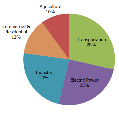
Effective public transportation is an effective way to bring households out of poverty and is a critical method of reducing carbon emissions in a country where transportation is the largest source of carbon emissions.

Source: https://www.epa.gov/ghgemissions/sources-greenhouse-gas-emissions
In Chautauqua County, the link between transportation and poverty reduction is quite clear based on a study commissioned by the United Way of Southern Chautauqua County. The study looked at the City of Jamestown, which is the largest city in the county and the anchor of the South County region.
