1. Introduction
Anyone who knows me knows that I’m a huge transit nerd. Lately, I’ve been trying to deepen my understanding of transit by challenging myself to work with and analyze transit data. To do that, I’m working on a side project to build a Jarrett Walker style transit frequency map for my hometown transit agency, Chautauqua Area Regional Transit System (CARTS). Ultimately, I’d like to perform a scaled down version of an Operational Analysis, using the Akron bus redesign as a reference. Then, I’d like to use that data to propose updates to CARTS that could help to reverse the trend of declining ridership.
I’ll start by outlining why transit service is important, and then sharing the results of my analysis of frequencies. In the appendix, I’ll share how I arrived at these figures, and my next steps in this project.
2. Background
a. Good transit is important for poverty reduction
First, we need to understand why good transit is important.
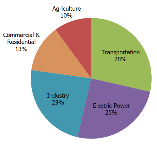
Effective public transportation is an effective way to bring households out of poverty and is a critical method of reducing carbon emissions in a country where transportation is the largest source of carbon emissions.

Source: https://www.epa.gov/ghgemissions/sources-greenhouse-gas-emissions
In Chautauqua County, the link between transportation and poverty reduction is quite clear based on a study commissioned by the United Way of Southern Chautauqua County. The study looked at the City of Jamestown, which is the largest city in the county and the anchor of the South County region.
It identified that transportation can be a “major barrier” to employment. A quarter of Jamestown households don’t have a vehicle, and many say that the public transit system is inadequate.
To illustrate that point, CARTS doesn’t currently have a comprehensive map on their website (other than a single image buried in the Schedule Book). Creating a map that details the routes that are available and their frequencies would help residents use the existing system, and would help leaders and residents alike identify ways to improve the public transit network.
In order to build this frequency map, I need to do a few things.
- I need to figure out the frequencies (headways) on each route
- I then need to use GIS, Tableau, or another visualization software to plot the routes on a map
- Optionally, I could also use something like Adobe Illustrator to create a map. I’m not quite sure how transit planning consultancies build their maps
b. GTFS data and SQL can be used to analyze transit service
To start off, I’m going to analyze CARTS schedules to determine the frequencies on each route. Once I have this data, I will use it to build the map, in a future post.
The schedule data is available in the for this project is the General Transit Feed Specification (GTFS) format, a standard used to describe the service that transit agencies provide. I found CARTS’ GTFS data here.
Initially, I struggled to figure out a way to analyze and display this data. First, I tried using Leaflet.js, which I had used in previous projects (you can see my attempt in the Appendix). That ended up failing and I struggled to understand how to move the project forward.
Separately, I started learning SQL through my participation in the Strategy + Operations Sprint through the Commons. We started learning about JOINs and then I realized that you could think of the GTFS data as a series of tables, and then use JOINs to combine the data in a useful way. The project was back on, and I was able to make progress.
You can see the specific queries I used in the appendix. You can use this code to run an analysis on your own transit network. Just modify the name of each table. In the next section, I share the results of my analysis.
3. Findings: The CARTS network runs infrequently
Using SQL and the GTFS data, I was able to generate the following two tables which give us the frequency of each route, as well as the number of buses that stop at each stop. I used frequency at noontime as the measure, to keep in line with the Akron bus frequency map. Specifically, I defined frequency as the number of buses (or number of trips) that occurred between 11am and 1pm.
The big takeaway shouldn’t be surprising for a cash strapped, rural transit network – CARTS doesn’t run frequently. In the following sections, I’ll quantify how infrequently it runs. To do so, I’ll use a metric called headway. The headway of a route, or stop, is a standard measure used in transit planning to describe the amount of time between two transit vehicles. For example, if a bus stops at a station 4 times an hour, the headway route is 15 mins. If a bus only stops once an hour, the headway is 60 mins. Frequent service is generally defined as 15 minute headways, or better.
a. Finding 1: Only one stop has frequent service. 18% of stops have 30 min. headways or better. 72% of stops have 60 min headways or worse
In this section, I looked at the number of buses that stop at each stop around noon. To calculate this, I used the SQL query in the Appendix (Query 1), which joins data from stops and stop_times.
There were 79 total stops. The only frequent stop is Junction, which refers to the CARTS hub in downtown Jamestown. The only other stop that comes close is Walmart, with 20 minute headways. Low headways mean long wait times, and higher time penalties for missing the bus. Lower headways means more freedom, but tends to be much more expensive.
Here’s a cumulative breakdown of stops, by headway:
| Headway | Number of stops |
| 15 mins or better | 1 |
| 30 mins or better | 15 |
| 45 mins or better | 22 |
| 60 mins or better | 75 |
| 90 mins or better | 75 |
| Total stops | 79 |
b. Finding 2: No CARTS routes have frequent service (bus every 15 minutes or better). Only 5 of 9 CARTS routes run more than one bus an hour
The Jamestown-Falconer route is the most frequent bus route, with scheduled 30 minute headways. Jamestown and Falconer are two of the densest areas in the county, so it makes sense that frequency is concentrated here. But the frequency of service is too low to be useful, and generally only those people who need it will rely on it.
The full breakdown of headways can be seen below:
Appendix
1. Queries
Query 1: How frequently a bus stops at each stop around noon
Here’s the SQL query I used to create this measure:
select `carts_gtfs`.`stops_txt`.`stop_id` AS `stop_id`,
`carts_gtfs`.`stops_txt`.`stop_name` AS `stop_name`,
count(distinct `carts_gtfs`.`stop_times_txt`.`trip_id`) AS `num_trips`
from (`carts_gtfs`.`stops_txt`
join `carts_gtfs`.`stop_times_txt`
on((`carts_gtfs`.`stops_txt`.`stop_id` = `carts_gtfs`.`stop_times_txt`.`stop_id`)))
where (`carts_gtfs`.`stop_times_txt`.`departure_time` between '11:00:00' and '13:00:00')
group by `carts_gtfs`.`stops_txt`.`stop_id`,`carts_gtfs`.`stops_txt`.`stop_name`
order by count(distinct `carts_gtfs`.`stop_times_txt`.`trip_id`) desc
Query 2: How frequently each route runs around noon
Here’s the SQL for this one:
SELECT
	routes_txt.route_long_name,
    routes_txt.route_id,
    routes_txt.route_color,
    count(DISTINCT(stop_times_txt.trip_id)) as unique_trips,
    120 / count(DISTINCT(stop_times_txt.trip_id)) as service_interval
FROM
	stop_times_txt
JOIN
	trips_txt ON stop_times_txt.trip_id = trips_txt.trip_id
JOIN
	routes_txt ON trips_txt.route_id = routes_txt.route_id
where (`carts_gtfs`.`stop_times_txt`.`departure_time` between '11:00:00' and '13:00:00')
group by routes_txt.route_long_name, routes_txt.route_id, routes_txt.route_color
order by unique_trips desc
2. Dead end attempt – using Leaflet.js
Prior to using SQL to analyze the data, I tried doing it in Leaflet.js. Leaflet.js is a library in Javascript that allows you to easily visualize GeoSpatial data. I used it previously to build out an interactive version of this map of old Synagogues in Detroit. You can view my version of the map here, and my GitHub repo here.
I tried to see if I could use Leaflet.js to plot all the routes. I started off by just trying to plot all of the bus stops, which are stored in stops_txt. I was able to do that with the following code (which you can also see on Github):
	//console.log(stop_times);
	function read_stops_csv(csvString){

		// use PapaParse to convert string to array of objects
		var data = Papa.parse(csvString, {header:true, dynamicTyping: true}).data;

		//for each row, create a market and add it to the map
		for (var i in data) {
			var row = data[i];
			//console.log(row);

			// DIY error handling
			if (row.stop_id == null) {
				break;
			}

			let popupContent = row.stop_name;
			var marker = L.marker([row.stop_lat, row.stop_lon],{
				opacity: 1
			}).bindPopup(popupContent);
			marker.addTo(map);
		}
	}

	// read data from csv
	$.get('gtfs-data/stops.txt', read_stops_csv);
That worked, and resulted in the map here.
But my subsequent efforts to try to analyze GTFS data in Leaflet.js failed, and I put the project on pause for a few weeks until learning SQL.
